Purple Line = 20 yr record highs
Yellow Line = 20 yr average
Green Line = 2009
Blue Line = 20 yr record lows
and from Climate4you.com:

Yellow Line = 20 yr average
Green Line = 2009
Blue Line = 20 yr record lows
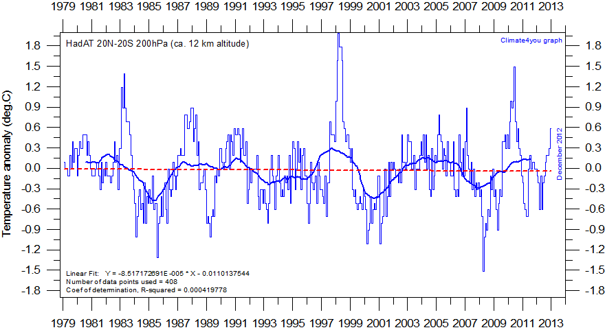
Climate models all suggest warming due to CO2 doubling to peak not at the surface in the tropics, but in the troposphere near the 200-300 hPa level, roughly corresponding to 12-9 km altitude. The main reason for the inter-model variation is that the amount of water vapour differs among the models. The expected warming above the tropics is 2-3 times larger than near the surface, regardless of the sensitivity of the particular model. This is, in fact, the very signature of greenhouse warming (cf. Lindzen 2007).In the diagrams below the temperature change at and above Equator is shown, using the Hadley Centre's radiosonde temperature product HadAT (200 and 300 hPa), and HadCRUT3 meteorological surface data. HadAT consists of temperature anomaly time series on 9 standard reporting pressure levels (850hPa to 30hPa), and is derived from 676 individual radiosonde stations with long-term records. Data uncertainties and limitations are described here. The latitudinal band used in the diagrams below is from 20oN to 20oS. To enable easy comparison with the global temperature changes shown higher up this page, 1979 has been chosen as start year. The full HadAT data series, however, goes back to 1958. Please note that the temperature scale in these diagrams are different from the scale used above, to accommodate the larger temperature variations at height. All data series were normalised by setting their starting value in January 1979 = 0, before inclusion in the diagrams below.

Temperature change at 200hPa (c. 12 km height) between 20oN and 20oS since 1979, according to HadAT. The thin blue line shows the monthly values, while the thick blue line represents the simple running 37 month average, nearly corresponding to a running 3 yr average.

No comments:
Post a Comment