Wednesday, March 31, 2010

Hansen signs Petition stating All man-made CO2 Must Stop and Reverse to Negative

Press Release 3/30/10 from 350.org & The Center For Biological Diversity (Where Life is Good (TM)):

the unobtainable goal (according to IPCC models of CO2 lifetime in the atmosphere-see below)

Campaign Launched to Gather 500,000 Signatures to Cap Greenhouse Gas Pollution at 350 Parts Per Million

Dr. James Hansen, Barbara Kingsolver, Ed Begley, Jr., Bonnie Raitt, Lemony Snicket, Sierra Club Board Member Among First Signers

WASHINGTON— The Center for Biological Diversity today launched a campaign to gather 500,000 signatures on a People’s Petition asking the Environmental Protection Agency to set a national pollution standard to reduce carbon dioxide pollution in the atmosphere to 350 parts per million. Atmospheric CO2 is currently at 390 parts per million and growing, causing a dangerous climate disruption.

Tuesday, March 30, 2010

CO2 Lifetime: Which do you believe- Models or Data?

The IPCC loves theoretical computer models, even when said models have not been experimentally verified or actually contradict experimental data. However, as Richard Feynman, PhD, Nobel Laureate in Physics, famously said "It doesn't matter how beautiful your theory is, it doesn't matter how smart you are. If your theory doesn't agree with experiment, it's wrong". As shown in a prior post, the IPCC AR4 states that the models at the heart of the confidence level of at least 90% that man is responsible for global warming have not been tested against observational data and furthermore the necessary tests to evaluate the models have yet to be developed. In addition, observational satellite data has since shown uniformly that the models fail miserably. Let that not be an impedance to the settled consensus, however. 

An analogous situation is also true of the second most important foundation of the AGW hypothesis, whereby the estimates of the lifetime of CO2 in the atmosphere are based upon entirely theoretical unvalidated computer models which estimate CO2 lifetimes in the atmosphere of hundreds to thousands of years in stark contrast to scores of observational measurements which show an average maximum lifetime of about 5 years:
Red line is IPCC computer model estimate (should actually be multiple hundreds of years)

More Evidence IPCC Models are Inadequate

The IPCC models place an unjustified and almost total reliance upon CO2 as the driver of climate, while ignoring ocean oscillations. Strange that a model of heat transfer would ignore the huge periodic oscillations of the reservoir of over 99% of the earth's heat content. A recent paper: Masahiro Ohashi and H. L. Tanaka, 2010: Vol. 6A (2010) : Data Analysis of Recent Warming Pattern in the Arctic. Special Edition -Special Edition of the Fourth Japan China Korea Joint Conference on Meteorology- p.1-4 is the subject of a highly recommended guest post at Roger Pielke Sr.'s Blog today. The article finds that most of the recent warming 1970-1990 in the arctic is a result of the natural variability of the Arctic Oscillation [AO] rather than the IPCC model explanation of anthropogenic global warming. From the abstract of the paper: "Since the decadal variation of the AO is recognized as the natural variability of the global atmosphere, it is shown that both of decadal variabilities before and after 1989 in the Arctic can be mostly explained by the natural variability of the AO not by the external response due to the human activity". On Dr. Pielke's blog posting, the author of the paper, Dr. Masahiro Ohashi, notes the implications of this work:

According to our result, the rapid warming during 1970-1990 contains a large fraction of unpredictable natural variability due to the AO. The subsequent period of 1990-2010 indicates a clear trend of the AO to be negative. The global warming has been stopped by natural variability superimposed on the gentle anthropogenic global warming. The important point is that the IPCC models have been tuned perfectly to fit the rapid warming during 1970-1990 by means of the ice-albedo feedback (anthropogenic forcing) which is not actually observed. IPCC models are justified with this wrong scientific basis and are applied to project the future global warming for 100 years in the future. Hence, we warn that the IPCC models overestimate the warming trend due to the mislead Arctic Oscillation.

Monday, March 29, 2010

Dr. Nils Axel Morner's Reply to Maldives Sea Level PR Stunt

On October 17, 2009, members of the Maldives' Cabinet donned scuba gear, dove to a table seated on the ocean floor, and used hand signals at an underwater meeting staged to highlight the threat of global warming to the lowest-lying nation on earth and requests for compensation from western nations emitting CO2. With a backdrop of coral, the meeting was a bid to draw attention to fears that rising sea levels caused by the melting of polar ice caps could swamp this Indian Ocean archipelago within a century. Its islands average 7 feet above sea level.
In response to this, sea level expert Dr. Nils Axel Morner wrote the open letter below to the President of the Maldives. Dr. Mörner is the past head of the Paleogeophysics and Geodynamics department at Stockholm University in Sweden. He is past president (1999-2003) of the INQUA Commission on Sea Level Changes and Coastal Evolution, leader of the Maldives Sea Level Project. Dr. Mörner been studying the sea level and its effects on coastal areas for over 38 years.

You have recently held an undersea Cabinet meeting to raise awareness of the idea that global sea level is rising and hence threatens to drown the Maldives. This proposition is not founded in observational facts and true scientific judgements, Accordingly it is incorrect. Therefore, I am most surprised at your action and must protest to its intended message.

Friday, March 26, 2010

Papers on the ANTI-Greenhouse Effect of CO2

Three papers which conclude that at current levels, CO2 (and methane) produce an anti-greenhouse effect due to interaction with H20 by forming clusters. The IR radiation absorption spectra and radiating power of the CO2-H2O and CH4-H2O clusters were calculated and determined to reduce the greenhouse effect.

Thursday, March 25, 2010

The Hansen Mars Challenge


Analysis of Mars Atmosphere Disproves AGW

A challenge to Hansen et al 1988:
clip_image002
No matter what scientific facts are presented to challenge the AGW ideology it is impossible for scientists to sway public opinion on this issue because the issue is political. It is very easy for high profile people who quote a scientific consensus that is supported by sophisticated computer models to convince the general public of anything that they want. 

Even though the computer models have never yielded a single result that matches observations, any criticism of the models is met with some sort of complex justification that is beyond the comprehension of the general public so it is readily accepted by the masses and those questioning the validity of the models are vilified by the promoters of the AGW agenda as skeptics and deniers who are in the pockets of big oil.
The sole support for AGW is the climate models, and the sole support for the climate models with respect to CO2 is the forcing parameter. There is no actual physical rational for the forcing parameter, because it was simply contrived from the assumption that observed warming of 0.6°C was due entirely to a 100ppmv increase in atmospheric CO2 concentration. There was never any verification of this parameter either by theory or observation. There is no justification for this parameter based on the physical properties of CO2, because the molecular configuration of the CO2 molecule precludes any significant effect from CO2 beyond a concentration of 300ppmv, and the current concentration is 386ppmv. 

There is no justification for this parameter based on observation because the observed notch in the spectrum created by CO2 is virtually identical for both the Earth and Mars, and Mars has over 9 times the physical concentration of CO2 in its atmosphere than the Earth has in its atmosphere. 

Even the reference temperature value for the parameter is faulty because the maximum temperature increase possibly attributable to human CO2 emissions is 0.1°C per century; not the 0.6°C that is used in the forcing parameter. 

The climate models use a forcing parameter based on the equation: 

CO2 rf = f * ln([CO2]/[CO2]prein)/ln(2) 
 
where f= rf for CO2 doubling 
 
In further documentation according to the IPCC, the “Radiative Forcing” ÄF, in watts per square meter, due to additional carbon dioxide in the atmosphere, can be calculated from the formula: 

ÄF = 5.35 ln C/Co 
 
The value 5.35 in this equation and the term [CO2]prein in the generalized equation demonstrate that the forcing parameter is based on the 100ppmv increase from the preindustrial value of 280ppmv and the 0.6°C of measured temperature over the time period that this 100ppmv increase occurred. 

Tuesday, March 23, 2010

MUST SEE: New Video on Mann-made Global Warming

New taxpayer-supported video propaganda on Global Warming was just released by the National Science Foundation, in which Michael Mann plays a prominent role. The discredited Mann hockey stick graph is shown with "hide the decline" and "Mike's Nature trick" included as a single continuous line between the tree ring and thermometer records. In answer to the question "what's unusual about the earth's warming during the past century?" Mann claims that the Medieval Warming Period and Little Ice Age (mostly erased using Mann-made statistics from his hockey stick graph) were regional only, whereas the current warming is global. Mann chooses to ignore the peer-reviewed studies of more than 800 scientists indicating that the Medieval Warming Period was global and most studies show hotter than today.


Mann also states that the models agree with observations (they don't).

Climategate: Professors Watson and Singer Debate

The BBC’s Andrew Neil squares off with Professors Robert Watson and Fred Singer to discuss the theory of Mann made Global Warming and the perilous state of the IPCC under Pachauri’s mismanagement.

Go to site for additional parts

Other videos of interest: 
Goddard Data and Global Sea Ice Doesn't Fit (repetitive but he has a point)
Worldwide Cold Not Seen since '70s Ice Age Scare

Monday, March 22, 2010

US Temperature Extremes Index Plunges Below 99 Year Mean

The NOAA National Climatic Data Center US Climate Extremes Index is designed to answer

"How has the climate changed over the past 50 or more years? In what ways and by how much? Many people, including climatologists, have been struggling with these questions for some time now, not only for scientific interest, but also to aid in policy decisions (IPCC 2001) and to inform the general public. In order to answer these questions, it is important to obtain comprehensive and intuitive information which allows interested parties to understand the scientific basis for confidence, or lack thereof, in the present understanding of the climate system. One tool, first developed as a framework for quantifying observed changes in climate within the contiguous Unites States, is the U.S. Climate Extremes Index (CEI).

Saturday, March 20, 2010

More ex-post "adjustments" to Satellite Sea-Level Altimetry

From a 2002 publication showing the Topex/Posiedon satellite altimetry sea level data for the eight years from 9/92-9/00, the global map shows stable to declining sea levels in most areas with the exception of the western Pacific, which is strongly influenced by periodic ENSO/El Nino/La Nina conditions.
The accompanying data below shows declining sea levels throughout most of the Pacific Ocean. The mean of the sea level changes (first number in each column) for each of the bands of the 3 major oceans shows a mean global sea level decrease of .4 mm/year. Yes, the bands for the 3 oceans are not the same size, but since the largest bands by far are in the Pacific Ocean and show the largest declines, the mean for the 3 oceans by area would therefore show an even greater decrease in mean sea level over the 8 year period. This is despite the fact that this period was also marked by the largest El Nino in the 20th century, which resulted in a large increase in the global mean.  
 
But that's not what the TOPEX/POSEIDON data show today, as somehow a global decrease in mean sea level evolved into a global increase of 3.1 mm/yr. This appears to be further confirmation of Dr. Nils Axel Morner's claim that the TOPEX satellite data was ex-post adjusted upward many years after the fact to show a false positive trend.  The data was further adjusted upward between 2005 and 2010 (almost 20 years after the start of the satellite record).

Related: An Analysis of TOPEX Sea Level Record

Glaciers - Science and Nonsense

Photo: Pat Quilty (Univ. Tasmania)

Cliff Ollier* takes issue with some common misconceptions about how ice-sheets move, and doubts many pronouncements about the “collapse” of the planet’s ice sheets.

Geoscientist 20.03 March 2010

In these days of warnings about climate change, the ice sheets of Greenland and Antarctica play an important role. Alan Carlin wrote “Hansen et al. believe that the most likely and most critical of these dangerous effects is the possibility of substantial sea level rise due to the breakup of parts or all of the ice sheets covering Greenland and West Antarctica.” (my emphasis).

Alarm started with ‘global warming’ but since the Earth failed to warm in the past 10 years it changed to ‘climate change” and most recently to “carbon pollution.” But the most graphic scare is still of rising sea levels, so many articles continue appear describing sea level rise of many metres caused by the melting of the icesheets.

Like the original warming scares, the melting scares are based on models, and poor models at that. The commonest one is the notion that glaciers slide downhill, lubricated by meltwater, and that this can pass a threshold and lead to melting of all the icesheets and a runaway rise in sea level. The sliding hypothesis was the best available to De Saussure (1779), but we have learned a lot since then – but it has been forgotten again in many modern models.

Hansen: Urban Heat Island Effect is 0.06°C

From a 3/19/10 draft of a NASA GISS paper, Hansen & Co. find the urban heat island effect in the US to be a mere 0.06°C temperature anomaly over the entire span of 1900-2009:

Citations not cited in the report include a paper showing urban heat island effects of up to 8°C, the work of Dr. Roy Spencer, surfacestations.org (Anthony Watts & Joe D'Aleo), and others. (H/T Tom Nelson)

Spiel Climate Sister Site Launched

A fully-automated computer-model of a climate Blog about other climate Blogs

The climate blog and media news feeds have gotten unwieldy for The Hockey Schtick so there is a new fully-automated sister site SpielClimate.blogspot.com just to handle the mass of feeds. Spiel Climate has feeds from all corners of the skeptic, luke warmist, and warmist blogs and news feeds. If you are a climate junkie and don't mind the occasional item from these feeds not related to climate and the lack of any humanoid editing, then please have a look. Spiel Climate is open to suggestions for new links - just post a comment at the bottom of the page.

The Best of Recent Climategate News archives from the upper right column of The Hockey Schtick will be housed at the bottom of the page at Spiel Climate. Helpful references in this debate are also there and open to suggestions as well.

Thursday, March 18, 2010

Climate Change Causing Negative Extinction in Arctic

Arctic Wildlife Index Increases 16% over last 34 years

From a paper presented today at The State of the Arctic meeting:
Tracking Trends in Arctic Wildlife: The Arctic Species Trend Index

For the first time, an index providing a pan-Arctic perspective on trends in the Arctic's living resources has been developed. The Arctic Species Trend Index (ASTI), like the global Living Planet Index (LPI), illustrates overall vertebrate population trends by integrating vertebrate population trend data of an appropriate standard from across the Arctic and over the last 34 years (1970 as the baseline). An increasing index indicates that overall more vertebrate populations in the Arctic are increasing than decreasing. Whereas a decreasing index, indicates the opposite situation.

A total of 965 populations of 306 species (representing 35% of all known arctic vertebrate species) were used to generate the ASTI. In contrast to the global LPI, whose overall decline is largely driven by declines in tropical vertebrate populations, the average population of arctic species rose by 16% between 1970 and 2004. This pattern is very similar to the temperate LPI and is consistent in both the North American and Eurasian Arctic.

Austrian Alps Glaciers Have Almost Disappeared Due to Abnormal Warmth!

(above photo from 1956 in National Geographic of the (melted) intersection of the Hintereisferner and Kesselwandferner glaciers, and photo below from August 2003)

Wednesday, March 17, 2010

CO2 Urban Death Domes

The NASA AIRS satellite is providing data on localized global CO2 levels, as shown in the map below for July 2009:
The map shows CO2 "hot spot" levels of 389 ppm along the coastal US and southern Europe but also hot spots in sparsely populated areas such as the middle of the Pacific Ocean, the Bering Strait, and Mongolia. But the most interesting aspect is that the difference between the CO2 concentration at the hot spots and the global mean is only 3-4 ppm, a 1% difference in concentration. Using the IPCC Climate Computer shows that this difference in CO2 levels is predicted to result in a temperature change of 0.04°C assuming the imaginary IPCC positive feedbacks, or 0.01°C not assuming the imaginary feedbacks.

°C and thereby lead to increased health effects from pollution. The press release goes on to say that CO2 should be taxed more when it is produced in cities vs. in rural areas because lowly CO2 is again being blamed as the cause of the Urban Heat Island effect. Once again, the harmless, essential, non-polluting trace gas CO2 is the wrongly convicted evil-doer because of junk science and ease of taxation. 

Tuesday, March 16, 2010

Arctic has still not received the memo on AGW

Arctic temperatures stable since 1958

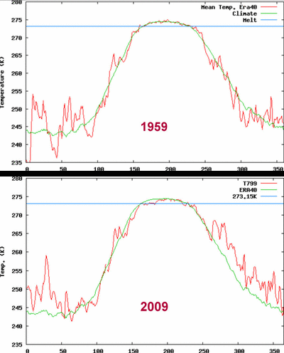
From the Copenhagen Centre for Ocean and Ice of the Danish Meteorological Institute, which has maintained daily mean temperatures (untouched by Phil Jones & CRU) for the Arctic area north of the 80th northern parallel since 1958, the critical summer temperatures (the peak in the middle of the graphs) shows that the summer arctic temperatures were stable to considerably less for the summer of 2009 compared to the summer of 1959 (& 1958 and indeed most years in the record). The temperatures for the summer of 2009 were also stable to considerably less than the ~50 year mean shown in green, and at or below the critical ice melting point of 273.15K (0°C) shown in blue during the first month of the summer. Before anyone accuses me of cherry-picking, go to the DMI website yourself and look at all the graphs from 1958-2009 and you will find absolutely no increasing trend in arctic summer temperature, as is also evident from the mean shown as the green line.

(X axis is the day of the year)

Monday, March 15, 2010

The UN IPCC Step-By-Step Guide to Fraud

Step 1: Create an organization within the UN with a mandate to prove a foregone conclusion, as stated at the UN website: The IPCC was founded in 1988 by the World Meteorological Organization and the UN Environment Programme with a mandate to produce accurate, balanced assessments about human-induced climate change

Step 2: Allow governments to appoint scientists who agree with the IPCC mandate to prove human-induced climate change. Skeptical scientists about human-induced climate change need not apply.

Step 3: Allow the scientists in "working groups" to produce their reports on the science behind the mandate (but go ahead and write the Summary Report for Policymakers beforehand). IPCC in secretive process selects the most sympathetic scientists as "lead authors".

Step 4: The scientists conclude that they really can't make any valid assessment of the relative confidence of the IPCC climate models and feedback assumptions because they haven't done a comprehensive set of observational tests (i.e. haven't compared the models to actual data) to find out if the models are any good. In the final paragraph of this critical section of the AR4 WG1 Chapter 8 page 52 the scientists state that a number of diagnostic tests [of the models] have been proposed, but few of them have been applied to the models currently in use. The inconvenient truth is that this has been done by John Christy, Richard Lindzen, et al, and the models have consistently failed miserably, but those scientists weren't part of the invited "consensus". Next it says it isn't even clear which diagnostic tests are critical to assess confidence in the models. The section concludes by saying that the things necessary to assess confidence in feedbacks simulated by different models have yet to be developed. In other words, the scientists can't make any assessment whatsoever of confidence of the models at the heart of the IPCC "consensus" on anthropogenic global warming.


Step 5: Ignore what the scientists said and in the only part most people read, the Summary for Policymakers, written by bureaucrats in advance of the scientific working group 1 report, state that our understanding of human-induced climate change has improved to the point that we give very high confidence (defined as at least 90%) that humans are responsible because the computer models mandated to say so do indeed say so. And to make it look extra impressive, throw in an exact number from one of the  GIGO computer models for human forcing with specified confidence limits to make it look like we have actually done those diagnostic tests the scientists in Working Group 1 said have yet to be developed.

(IPCC AR4 Summary for Policymakers, page 3, highlights added)

Sunday, March 14, 2010

Global Sea Level Change Redux

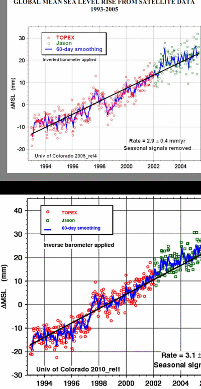
It's Deja Vu all over again, but this time the highly questionable "adjustments" are not to temperature records, but to satellite sea level altimetry data. A publication at the EPA website called SEALEVEL_FINAL.PDF, has a graph of TOPEX/JASON sea level rise circa 2005 (see notation in lower left of blink chart) on page 7. The 2005 version of the data is no longer available online, but comparing to the current version online shows:
  • The drop following the 1997-1998 record El Nino essentially disappears and the remainder of the record builds upon the El Nino anomaly (see below)
  • The slope over the entire periods increases from 2.9 mm to 3.1 mm/yr even though plotting the 2005-2009 data shows the slope decreased to less than half the former rate
  • The data shows much less dispersion in 2010, even from the TOPEX satellite that was no longer in operation for more than 3 years prior to the 2005 graph
  • Most of the low outliers are pushed up and high outliers left in for the 2010 chart
  • The JASON data in 2005 prior to removing the low outliers appears to show little if any sea rise
  • The near stationary trend of TOPEX sea level data from the 2 graphs below the blink graph is replaced by an increasing trend in the 2005 graph and even more so in the 2010 graph. 
  • The beginning sea level anomaly is about 5 mm less in the 2005 chart than the 2010 chart

gif maker


The AVISO website has the following graph of the TOPEX data 1993-1998 to illustrate that the record El Nino in 1997-1998 had a significant effect on the global mean sea level:

This graph shows essentially flat sea levels until the record El Nino of 1997-1998. The increase in the moving average of sea level is 20 mm from the beginning of the TOPEX mission to the 1997 peak of the El Nino, the peak further increasing during the same period to 21 mm in the 2005 graph and to 23 mm in the 2010 graph. A graph of the same data from Dr. Nils-Axel Mörner's chapter in the Encyclopedia of Coastal Science also shows the same flat sea levels until the 1997-1998 record El Nino blip followed by a return to essentially the same flat sea levels, but this has since mostly disappeared in the 2005 graph and almost entirely in the 2010 graph.

Sea Level Change: The Last 120 Million Years

Sea Level Change over the past 120 million years: (note Y axis is inverted for sea levels with lower sea levels shown as higher on Y axis on the following 2 graphs)
During most of the past 120 million years, sea levels have been 50-100 meters higher than the present. Sea levels dropped ~130 meters below the present during the last ice age and have risen since then throughout the current interglacial, but at a much slower rate over the past 7000 years & had almost no change over the past 2000 years according to paleological studies (see below).  

Saturday, March 13, 2010

Engineering Earth's Thermostat with CO2?


Adapted From Hydrocarbon Processing, Pierre R. Latour, Guest Columnist


Earth's temperature is a chemical process system. Review of control system engineering of Earth's thermostat with anthropogenic CO2 in 1997 proved it will never work because it is an unmeasurable, unobservable and uncontrollable system. CO2 does not affect temperature; temperature affects CO2. There are no greenhouse gases in physics. CO2 is not a pollutant; it is green plant food. Global warming stabilized since 1998.
...I am a registered PE chemical engineer in Texas and control system engineer in California. I was Control Engineer of the Year 1999 and Purdue's Outstanding Chemical Engineer 2007. I am a contributor to the US Senate Minority Report, "700 Scientists Dissent and Debunk Man-Made Global Warming,". I have no financial incentive in the outcome. I am an anthropogenic global warming (AGW) skeptic denier.

Science.
• CO2 is not a pollutant; it is harmless green plant food. CO2 is the inert result of complete oxidation. There are only two CO2 gas phase reactions, both are endothermic: arc welding and photosynthesis (CO2 + H2O + sunlight = sugars + O2, catalyzed by chlorophyll). US Navy submarines limit CO2 to < 8,000 ppmv only because at that level it displaces O2.
• Halting all combustion of hydrocarbons (oil, gas, coal and wood) by man will not measurably affect atmospheric CO2 content, now 380 ppm. A simple material balance shows man generates 30 billion tons/year (this is neither a big nor a small number, it is just a number) while plants consume 7 trillion tons/year (this is neither a big nor a small number, it is just a number). Forest fires, rotting flora and volcanoes input most of the CO2 to the atmosphere. Total input or output is >7. The ratio is 0.03/7 = 0.0043 (this is a small ratio). Cutting the 30 in half to 15 will drop CO2 by 100 ppm after 70 years.
• CO2 does not affect temperature; rather temperature affects CO2. Data for the past 400,000 years, reported by Al Gore, An Inconvenient Truth in 2005, shows they cycle together but CO2 lags temperature by about 800 years. Solubility of CO2 in water, oceans, beer and champagne decreases with temperature so solar warming of the ocean releases dissolved CO2 and cooling reabsorbs it. Solar radiation drives Earth's temperature; CO2 has nothing to do with it.

Sea Level Decrease 1992-2009 Along Most of West Coast of North & South America

Plotting the global mean sea level (MSL) trends (from multi-satellite mission data) over almost 17 years from Oct 1992 - July 2009 shows a decrease in mean sea levels along most of the west coast of North & South America of approximately 50 mm or 5 cm during that period.
(Above graph was created by using photoshop neutral color picker on the original graph below from the satellite data browser to alter color scaling for clarity of positive and negative trends).
The plots show most of the sea level rise was concentrated in the equatorial Pacific region where periodic El Nino and La Nina events raise ocean temperatures and regional sea level (large red area in graph). Small increases of 1 mm - 3.5 mm/yr are found at most other coastal regions during the period. Indeed, the AVISO site notes
Mean rise in sea level is only part of the story...The rise in the level of the oceans is far from uniform. In fact, while in certain ocean regions the sea level has indeed risen (by up to 20 millimeters a year in places), in others it has fallen an equivalent amount. Although the global trend indicates a rise in the mean level of the oceans, there are marked regional differences that vary between -10 and 10 mm/year...Isolated variations in MSL are thus revealed, mainly in the major ocean currents.
El Niño is behind rise in Mean Sea Level


Global Mean Sea Level (MSL, blue line) and Sea Surface Temperature (SST, red dotted line) from early 1993 to mid-1998. In 1997 there was a rise of 15 mm at the start of the largest El Nino of the 20th century. The meteorological effects of El Niño 1997-1998 were felt worldwide, but it also contributed to variations in mean sea level. Indeed, sea level anomalies measured by Topex/Poseidon were over 20 centimeters in the equatorial Pacific when the phenomenon was at its height (and as much as 30 centimeters off the coast of Peru). These anomalies obviously had an effect on the global mean of sea levels.
Interesting that as the Pacific Ocean recovers from the record 1997-1998 El Nino and three smaller El Ninos since, and the Pacific Decadal Oscillation has entered a negative phase, we find that global sea level per ARGO+GRACE shows declining global sea levels 2004-2009. 

Epilogue: James Hansen's prediction of sea level rise of 5 meters by 2100 seems a tad off trend. UPDATE: Hansen increased his prediction to 75 meters in 2009 editorial. The decreasing sea levels along the west coast of North America show Al Gore made a wise purchase of a $4.5 million dollar condo in San Francisco in the part of the city An Inconvenient Truth showed would be submerged.

Recommended Climate Videos at Climateclips.com

Fred Singer Fred Singer, professor Emeritus af environmental science at the University of Virginia. Former l...


Other recommended videos at Climateclips.com:
Warming Not Unusual The 20th century warming is not unusual, Says Dr. Sallie Baliunas and Dr. Willie Soon from the harva...
The Greenhouse and CO2 The greenhouse and CO2 is not straight on a simple matter. "It´s more complicated than the IPCC proc...
David Legates David R. Legates is an Associate Professor and Director of the Center for Climatic Research at...
John R Christy John Christy, Professor of Atmospheric Science and Director of the Earth. System Science Center at ...
Look At The Right Place"If you want to know how the climate system on Earth works, you should look at the bulk of the atmos...
H2O The Dominant Greenhouse Gas The role of Water vapor and clouds in the atmosphere are by far greater than that of CO2....
Henrik Svensmark Professor Henrik Svensmark is the head of the Centre for Sun-Climate Research, at DTU Space, Technic...
Jørgen Peder Steffensen Jørgen Peder Steffensen is associate professor and curator at the centre for Ice and Climate at Nie...
Willie Soon Willie Wei-Hock Soon (born 1966) is an astrophysicist at the Solar and Stellar Physics Division of...
Jørgen Peder Steffensen Jørgen Peder Steffensen is associate professor and curator at the centre for Ice and Climate at Nie..
Look At The Right Place "If you want to know how the climate system on Earth works, you should look at the bulk of the atmos.
Nils-Axel Moerner’s trip to the Maldives
We are living in cold times "We started to observe temperatures at the coldest spot in the last 10,000 years"- the Little Ice Age

Recommended: CO2 The Debate is Not Over


Another Broken Hockey Stick the IPCC didn't Want

Yet another broken hockey stick paleoclimate reconstruction passed over by the IPCC for AR4 comes from the 2001 paper Briffa KR, Osborn TJ, Schweingruber FH, Harris IC, Jones PD, Shiyatov SG and Vaganov EA (2001) Low-frequency temperature variations from a northern tree-ring-density network. Journal of Geophysical Research 106, 2929-2941. This example was found at a blog posting McClimategate continues: Yet another false accusation from McIntyre and McKitrick, an amusing "explanation" of one of several infamous Briffa/Osborn climategate FUDGE factor programs which "APPLIES A VERY ARTIFICIAL CORRECTION FOR THE DECLINE" (briffa_sep98_e.pro is only one of the climategate programs with so-called FUDGE factors). The author of the blog posting has no idea if one of said FUDGE factor programs applied to this paper or any other paper, but thinks Osborn's explanation makes sense:
...I had applied an adjustment to this particular set of data (for the purposes of exploring the consequences of recent trends for the calibration of tree-ring temperature proxies) and that if I did plot them it would give a false impression of the agreement between tree-rings and temperature because of the adjustment. 
In other words, Osborn had used FUDGE factors to flatten the past and steepen the recent tree-ring temperature proxy to explore how nicely the tree-rings would agree with the thermometers, if there wasn't that annoying "divergence problem" after 1960, and how unprecedented the 20th century temperature proxy would look in comparison to the past. Begs the question, why is there any scientific basis to waste valuable time exploring FUDGED data with VERY ARTIFICIAL CORRECTIONS?

The blog post then proves that there is no way Briffa, Osborn, et al ever used a FUDGE factor in any publication, at least not on this particular graph in this particular paper, by showing this tree-ring temperature proxy:

 
(notations in red added)
The reason of course being that the tree-ring proxy really shows the 1940's to be by far the hottest part of the 20th century, yet even the 1940's were by this proxy as hot as ~1800 and ~1500, and the Medieval Warming Period (which hundreds of paleoclimate studies find to be hotter than the present) is not even shown. Once again the so-called "divergence problem" rears it's ugly head, with the tree-rings not cooperating with the instrumental (thermometer) record and taking a dive after the 1950's, but according to the blog posting:
the paper also states the proxy data for many chronologies after 1960 was unreliable and should not be used for calibration; this period was also excluded for the various cross-comparisons between regional chronologies and with other reconstructions:
The period after 1960 was not used to avoid bias in the regression coefficients that could be generated by an anomalous decline in tree density measurements over recent decades that is not forced by temperature[Briffa et al., 1998b].
This is scientific nonsense. If the tree rings weren't reliable thermometers after 1960, then they can not be considered to be reliable thermometers prior to 1960, no matter how much obfuscated language and unproven theories are used. Secondly, even if the trees were good thermometers prior to 1960, the reconstruction shows the temperature to be as hot or hotter than 1960 multiple times in the past and therefore shows there is no unprecedented anthropogenic rise in temperature. Thirdly, there is the never discussed Y-axis problem, wherein nobody knows where to graft the instrumental record relative to the tree-ring record. The above graph could have started the instrumental record at a temperature anomaly of -1 degree and then the latter half of that record would match up with the tree-rings from 1960 onward and the "divergence problem" would have been from 1900-1960 instead of 1960-2000. This makes just as much sense as what Briffa et al have done, although neither is appropriate.

Thursday, March 11, 2010

MUST SEE: New Richard Lindzen Debate


James Hansen "boxed-in" on the Witness Stand and by Actual Data

In this 2007 paper, James Hansen, head of GISS and climate-alarmist-in-chief, recounted when he was called as a witness in a lawsuit, and "boxed-in" by an attorney who asked him to name just one other scientist who agreed with his assertion that sea levels would rise more than 1 meter this century, stating "I could not, instantly."


read 2nd column below: The court case.

Even though Hansen couldn't think of a single scientist who agreed with him on this settled scientific consensus, he continues on with his usual political calls to action [note to Hansen: taxpayer funded scientists are supposed to publish scientific papers for the literature, not biased political calls to action] and concludes that with all sorts of imaginary additional positive feedbacks that the climate will soon spin out of control and produce a rise in sea level of 5 meters this century (UPDATE: Hansen upped estimate to 75 meters in 2009 editorial). Apparently he doesn't look at the NASA data from JASON which has shown a decrease in the rate of sea level rise to 1.5mm/yr (0.15m/century) over the past 6 years, less than half of the prior rate (sea level has been slowly rising since the last ice age).  He should also look at the ARGO+GRACE data showing a decrease in sea levels 2004-2009. He should also consider that the NASA satellite data shows that negative feedbacks dominate climate, all the while CO2 continues its steady (linear) rise that will take 234 years to double at the current rate.  As a physicist, he should understand that the sum of positive feedbacks has to equal the sum of negative feedbacks, otherwise the earth violates the equilibrium demanded by the 2nd law of thermodynamics and becomes a perpetual heat engine. He also doesn't acknowledge the historical records of natural Greenland ice sheet melt during the Medieval Warming Period, which allowed the Vikings to colonize and cultivate Greenland, their agricultural land now covered again by a giant ice sheet...and so on.
In this paper, Hansen states that GRACE satellite gravitometer data shows that both Greenland and Antarctica are losing ice mass at substantial rates (and doesn't mention any other parts of the globe). Here's what the GRACE data (using all data available online 2003-2009, expressed as "equivalent water thickness") actually shows for the entire globe and selected trend plots for areas with the most change:
GRACE Canada Trend:


Monday, March 8, 2010

Climate Sensitivity: which do you believe-models or data?

Climate sensitivity (expected change in global temperature due to a doubling of CO2 levels/Watts per sq meter (°C/(W/m²))) according to actual data:

  • Spencer:   .18         (see slide below, recent satellite data)
  • Lindzen:   .08 -.3   (derived from WSJ article about pre-publication results)
  • Monckton:   .12     (see slide below)
  • Paltridge:   .1 - .3   (based on NCEP trends, figure 10 of paper)
  • Schwartz:  .3           (paper)
  • Spectroscopic data without feedbacks:  .3  (see slide below, and derived from GISS email)

And according to the fictitious GIGO computer models of:

  • IPCC:   .55 - 1.1      (see Dr. Spencer's & Monckton's slides below; average .88)
  • NASA/GISS:   1.135     (derived from recently released NASA/GISS emails)

which incorporate imaginary mystical positive feedback amplification factors as much as 14 times higher (1.135/.08) than what the empirical data shows.

Which do you believe?

From Dr. Roy Spencer's Lecture: (part 2)
From Lord Monckton's Lecture:
(Note some figures approximated from graphs. Note any sensitivity number less than the 0.3 °C/(W/m²) derived from spectroscopic data implies that the net feedback is negative not positive)

Related: Climate models and the laws of physics

Related: Theoretical derivation of Sensitivity (~.3)

Related: A Critical Examination of Climate Change

"It doesn't matter how beautiful your theory is, it doesn't matter how smart you are. If your theory doesn't agree with experiment, it's wrong" - Richard Feynman,  Nobel Laureate in Physics

Still Waiting

From Science October 1, 2009:

This article from October 2009 states that 10 year pauses in global warming occur only around 2% of the time in the Hadley CRU 700 year climate simulation, and since at the time of publication it was claimed temperatures had only been stalled 10 years, we should just "wait a bit" because global warming is sure to reoccur, since pauses as long as 15 years are rare. Flash forward to 2/13/10, Phil Jones of CRU now states that for the past 15 years there has been no ‘statistically significant’ warming. The Hadley CRU simulation mentions no pauses of global warming exceeding 15 years in their simulation. Their models dismiss variability in solar activity and fluctuations in ocean oscillations, which can have multi-decadal periodicities of 30, 60, 120, etc. years.

Sunday, March 7, 2010

Greenhouse Effect of CO2 Already Saturated: New Miskolczi Video

Dr. Ferenc Miskolczi, a former NASA Physicist, published his peer-reviewed provocative saturated greenhouse theory 3 years ago challenging the widespread belief in man-made global warming, and his work remains unchallenged with no peer-reviewed rebuttal nor critique published. Dr. Miskolczi concludes,

"Earth-type planetary atmospheres, having partial cloud cover and unlimited reservoirs of water vapor, maintain an energetically maximized (constant, ‘saturated’) greenhouse effect that cannot be increased by emissions."
See prior Hockey Schtick posts with the original paper and explanations and interviews. A YouTube video is now available explaining the theory in simplified form:  


Other analyses of the physics of the Greenhouse Effect also come to similar conclusions (see here  here  here  here  here(pdf) here and empirical confirmation from satellite data). Gavin, Trenberth, Hansen et al where are you? [Cue crickets]

Related

The Sunday Funnies

Global Warming Consensus Reaches 130% with -50% Against
It's official: the consensus for Man-made Climate Change is now over-unanimous. The results from a recent poll conducted by the Mann-Hansen Group strongly support Mann-made Climate Change theories by 130% for to -50% against. This unprecedented result was obtained by counting a 'no' vote as a negative response which is added by subtracting. This also generates a positive feedback raising the pro vote beyond the 100% level.
Explained a Mann-Hansen expert, "Yes, the numbers don't exactly add up to 100, a discrepancy we attribute to the carbon offset, as the poll takers, being life forms, have quite a bit of carbon in them. In any case, the whole thing has man's carbon fingerprints all over it. Our computer models can rectify this using the customary Flexible Up and Down Guess Estimate, or FUDGE factor. This might seem unnatural, but Man-made Climate Change is unnatural, so the consensus may as well be, too. You have to fight fire with fire."
He continued, "The Precautionary Principle would seem to imply we act with caution, but as the consensus has passed the 100% tipping point, it no longer applies. This invokes the Post-Cautionary Principle meaning radical, precipitous action is now required. Which is what we've been saying all along, only now we've produced some overwhelming numbers to back us up."
  • Hell freezes over; global-warming deniers exploit incident to mislead public
  • Chicago Olympics threatened by advancing glaciers; police rounds up local global-warming deniers as a preventive measure