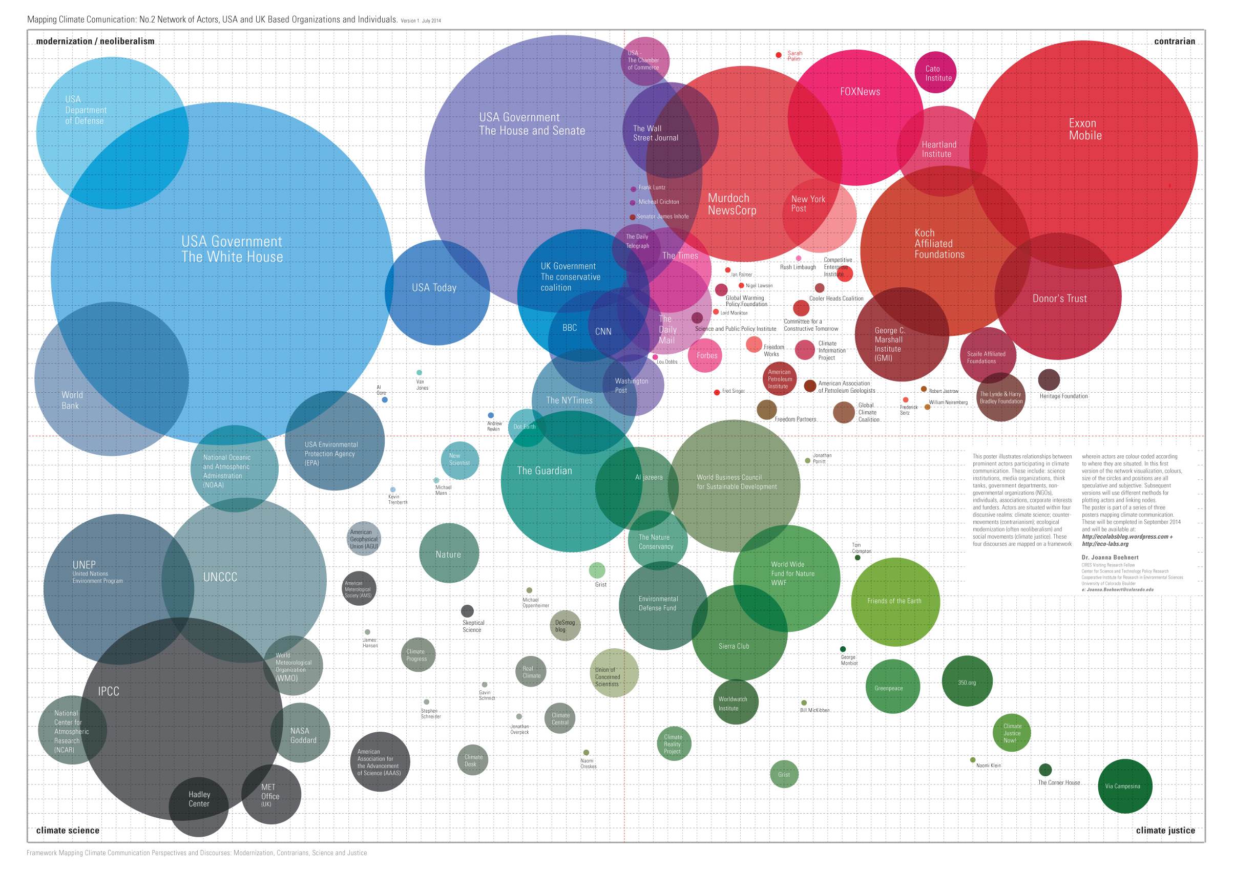
According to the chart, Exxon-Mobile (the big red circle in the upper right) is the biggest "contrarian" "climate justice actor," demonstrably false as Exxon-Mobile hasn't given anything to climate think-tank organizations for many years, while donating many millions to climate alarmist organizations. It's more of the same false meme repeated over and over by warmists that climate skeptics are funded by the oil industry, disproven time and again.
Reading the fine print on Dr. Boehnert's blog, she admits "the size of the circles and their positions are all speculative," i.e. not based upon any objective data whatsoever. Good enough for alarmist work.
The "map" is rather amusing, giving circles to "Skeptical Science", but not WUWT or Climate Depot which have much higher traffic, gives circles to Bill McKibben and Michael Mann, but not Anthony Watts or Steve McIntyre, etc. etc., have a look:
from Dr. Beohnert's blog:
from Dr. Beohnert's blog:
Mapping Climate Communication, new posters July 2014
Network of Actors, USA and UK Based Organizations and Individuals. Version 1. July 2014
The poster illustrates relationships between prominent actors and major organizations participating in climate communication. These include: science institutions, media organizations, think tanks, government departments, non-governmental organization (NGOs) and individuals – along with some of the more significant funders. Actors are situated within four discursive realms: climate science; counter-movements (contrarianism); ecological modernization (often neoliberalism); and social movements (climate justice). These four discourses are mapped on a framework wherein actors are colour-coded according to where they are situated. In this first version the colour, the size of the circles and their positions are all speculative. Subsequent versions will use different methods for plotting the actors and linking the nodes.
Have you seen some of the other "infographics" over there?
ReplyDeleteThey're nothing but willful puke-inducing propaganda dressed up as some kind of vaguely academic enterprise.
I, frankly, can't believe that our sciences and academies have devolved to the point that this is in any way acceptable.
I didn't look since the one graph above was nauseating and discrediting enough, but now that I have with your suggestion, you're absolutely right. The first graph Fig 2 claims "approximate funding for climate contrarians" in 2014 was 42 million. LOL False more like zero
DeleteON GLOBAL WARMING, FOLLOW THE MONEY http://feedly.com/e/-uFhBAKT
ReplyDelete