Thursday, February 27, 2014

New paper finds 100% of the trend in number of "hot days" is artificial, due to poor-siting of thermometers, not global warming

A paper published today in Theoretical and Applied Climatology examines the effect of urbanization on extreme temperature readings in North China and finds statistically significant evidence that urbanization [the Urban Heat Island [UHI] effect] is responsible for 100% of the artificial trend in number of hot days, and 94.1% of the artificial trend in extreme maximum temperatures. In other words, 100% of the reported trends in the number of hot days are due to poor-siting of temperature stations, and have absolutely nothing to do with alleged man-made global warming.

The artificial urbanization contributions to overall trends reported by the authors are:

Urbanization contributions to the overall trends:

hot days 100%

cold days 38%

frost days 42.2%

diurnal temperature range (DTR) 40%

extreme maximum temperature 94.1%

extreme minimum temperature 47%


WSJ: Global Warming Heats Up: The public could use an honest debate

Global Warming Heats Up

The public could use an honest debate.

By PETE DU PONT
Feb. 27, 2014 3:24 p.m. ET  THE WALL STREET JOURNAL

Global warming is back. Not actual global warming, as the decade-long trend of little to no increase in temperatures continues. But the topic of global warming is back in the news. From Secretary of State John Kerry's recent climate comments in Jakarta to the White House's 2014 "year of action" plan on carbon emissions, global warming has garnered more ink and pixels than we've seen in a while.

It's an open question whether this renewed emphasis reflects sincere concern about global warming or is just the Obama administration playing to part of its base prior to the midterm elections. Either way, the White House and the eco-left must be disappointed by polls that continue to show Americans do not share their sense of urgency. Even though many believe some warming exists and is at least partly anthropogenic, the vast majority consider it a low priority. In a January Pew Research poll, climate change was ranked 19th out of 20 items for the president and Congress to address.

The warming alarmists might earn more support if they acted less like they had something to hide and actually allowed open debate. Perhaps they could respond to their critics rationally instead of reflexively branding them heretics, suitable for whatever is the modern university and research center equivalent of burning at the stake. Real science does not fear those who challenge it, does not work to have challengers' articles banned from science journals, and does not compare skeptics to Holocaust deniers or, as Mr. Kerry did in Jakarta, members of the "Flat Earth Society."

A movement with confidence in its scientific theories would be able to admit there are many climate factors beyond carbon dioxide that are not yet well understood, and that some climate models have been shown to be unreliable. Such a movement would not downplay or whitewash leaked emails evincing the possibility of massaged data. When it criticizes its skeptics as hired guns of the fossil-fuel industry who are influenced by money, it would be willing to acknowledge that it thrives on government and private funding that would shrink if its research did not continue to say warming is here and getting worse. And there would be more confessions such as Al Gore's belated acknowledgment that his support for ethanol was misguided.

All that might not be easy, but what comes next would be downright difficult. The alarmists must admit that every policy decision involves an equation and that polices directed at reducing carbon emissions come with costs. Robert Bryce, a senior fellow at the Manhattan Institute, just issued a study that points to European Union climate polices (renewable energy subsidies and mandates, as well as a carbon cap-and-trade scheme) as a significant reason the 27 EU nations pay on average more than twice what we pay in the U.S. per residential kilowatt-hour of electricity, with Germany paying three times as much. Following such policies in the U.S. would shrink our economy as it would cost more not just to run our homes, but to power our offices and factories and operate our schools and hospitals. It's fine if the alarmists feel these higher costs and the impact on jobs and our economy are worth bearing, but they need to admit these negative impacts and justify them to the public.

Finally, the alarmists must admit that it is not certain their policies would significantly reduce the rising temperatures they predict. They need to admit that, for some of them, their policy prescriptions are really about control of our economy. Many want government control of the energy sector because they ideologically prefer it to free markets. Some want to stifle economic growth in America in a foolish and counterproductive attempt at achieving global economic equality.

Those who sincerely hold to such views must share their reasoning and try to justify it openly instead of keeping it hidden. A strong U.S. economy does much good throughout the world, including the billions spent combating the horrific AIDS epidemic in Africa and driving other humanitarian efforts—safe drinking water, malaria prevention, etc.—funded by the government and by private contributions and efforts. The alarmists need to acknowledge their policies would sentence more of our world's poor to poverty, disease and premature death.

To be sure, the science is not settled. The alarmists may be correct about projected warming. They may be correct that the costs of their proposed policies would be worth it if those policies avoid some of the negative impacts of that projected warming. If they truly feel they are right, they have an even greater responsibility to drop their insular and defensive attitude and debate these issues openly.

Wednesday, February 26, 2014

Don't Believe Obama's Climate Change Hype


Don't Believe The President's Climate Change Hype


By PAUL DRIESSEN
2/26/14  INVESTOR'S BUSINESS DAILY
'Climate change is a fact," President Obama announced in his State of the Union address. Actually, it's been a fact since Earth was formed.
So are the changing solar energy outputs that cause global warm and cold periods, glacial epochs and little ice ages — and the periodically shifting ocean currents, jet streams, polar vortexes, El Ninos and La Ninas that drive many weather patterns, storms and droughts.
However, just about anything else the president, Environmental Protection Agency and other government agencies say about climate change should be taken with a health care, Benghazi, IRS and NSA grain of salt.
When they claim "97% of scientists say the planet is warming and human activity is contributing to it," remember: This is based on 75 of 77 "climate scientists" who were selected from a 2010 survey that went to 10,257 scientists.
In contrast, a U.S. Senate report listed 1,000 international climate scientists who dissent from "man-made climate catastrophe" claims. More than 31,000 American scientists signed a statement saying they disagree with alarmist predictions. And a 2013 survey found 48% of American meteorologists do not believe humans are causing dangerous climate change.
Moreover, "contributing to" is meaningless. Is it a 1%, 5%, 20% or 90% contribution? Scientists still cannot separate human factors from the numerous powerful, interrelated solar, cosmic, oceanic, terrestrial and other forces that cause climate change and weather events.
When the president says "carbon pollution in our atmosphere has increased dramatically," remember: It's not "carbon" (soot); it's carbon dioxide, and CO2 is not pollution. It's the plant-fertilizing gas that makes life on Earth possible.
Furthermore, increased "dramatically" means rising from 325 parts per million (0.025% of the atmosphere) in 1975, when scientists were worried about global cooling, to about 400 ppm (0.040%) today.
Oxygen is 21% of atmospheric gases (210,000 ppm). Argon is 0.93% (9,300 ppm). About 90% of the "greenhouse effect" is from water vapor. And most of the annual addition to atmospheric carbon dioxide is from volcanoes, subsea vents and other natural sources.
Over the past 16 years, while CO2 levels continued to climb, average planetary temperatures did not budge. The eight years since a Category 3 hurricane made landfall in the United States is the longest such period in over a century. U.S. tornado frequency remains close to a record low. Sea levels are rising at just 7 inches per century.
If alarmists blame disasters on carbon dioxide, shouldn't they also credit the "gas of life" for these realities?
What should concern us is not climate change — unless a continued solar quiescence ushers in another prolonged cold era. The real danger is the ways EPA is acting in the name of preventing climate change: regulating "greenhouse gases" from power plants and other sources, via executive fiat backed up by fraudulent science, without regard for our laws and Constitution, and with no apparent concern for the harmful consequences of its actions.
"Dangerous man-made climate change" is being used to excuse spending some $22 billion per year on biased climate change studies, massive solar projects across desert habitats, wind turbines that slaughter millions of birds and bats annually and ethanol programs that require millions of acres of land and vast quantities of water, fertilizer, pesticides and fossil fuels to produce a gasoline additive that reduces mileage, harms engines, drives up food prices and increases CO2 emissions.
Climate change is being used to justify EPA's war on coal, interminable delays in approving the Keystone pipeline and opposition to oil and gas leasing, drilling and fracking.
These policies allow government agencies to regulate virtually everything we make, grow, ship, eat, drive and do. They put legislators, bureaucrats, activists and courts in ever-increasing control over our lives, livelihoods, liberties, living standards and life spans.
They impair the health and welfare of millions. Being unemployed — or holding multiple lower-paying part-time jobs — means greater stress, reduced nutrition, sleep deprivation, higher incidences of depression, greater alcohol, drug, spousal and child abuse, higher suicide rates and lower life expectancies.
Even worse, it's all for nothing — even if carbon dioxide does "contribute to" climate change.
Germany, China and India are building new coal-fueled power plants every week. Under agreements signed at the recent U.N. climate conference in Poland, developing nations must merely make "contributions" toward lower emissions when they are "ready to do so." That means atmospheric CO2 concentrations will continue to climb.
When the scheme finally implodes, government overseers will likely repeat Hillary Clinton's infamous denial of responsibility: "What difference at this point does it make?" We are caught in a climate trap that our bureaucrats and politicians have set for us. How will we get out?
• Driessen is senior policy adviser for the Committee For A Constructive Tomorrow and author of "Eco-Imperialism: Green Power, Black Death."

Tuesday, February 25, 2014

The political hot potato of global warming; How Obama & Kerry try to appease the eco-left

The Heat Is On

A transcript of the weekend's program on FOX News Channel.

Feb. 23, 2014  THE WALL STREET JOURNAL

Paul Gigot: This week on "The Journal Editorial Report," President Obama pressing ahead with his climate-change agenda. Will he soon be getting some help from a hedge-fund billionaire? ...

Gigot: Welcome to "The Journal Editorial Report." I'm Paul Gigot.

President Obama, making good on his State on the Union to act with or without Congress, ordered tough new fuel-efficiency standards for American trucks this week, a move aides say is just part of a push to address climate change through the use of executive power. The announcement came days after Secretary of State John Kerry attacked global-warning skeptics as shoddy scientists and extreme ideologues and called global climate change one of the top threats of our time.
Kerry: "Terrorism, epidemics, poverty, the proliferation of weapons of mass destruction--all challenges that know no borders. The reality is that climate change ranks right up there with every single one of them."
Gigot: Joining the panel this week, Wall Street Journal columnist and deputy editor Dan Henninger, Washington columnist Kim Strassel and assistant editorial page editor James Freeman.

So, Dan, that language looked calculated. That didn't look like he was speaking off the cuff. Meant to say it. So what is Secretary Kerry and the administration trying to do here?

Henninger: Let's put it this way, Paul, I don't know whether you can possibly be too cynical about what John Kerry was doing here. It's about politics. And I think the closer we get to the November elections, the more we're going to see the standard Democratic playbook, which is to try to position Republicans as in an awful light as opposed to what is undeniably good, as the president did in his re-election campaign. And the idea here will be that climate change is--and you're trying to move voters. And in this case, they're trying to move younger voters, people in their early 20s, the way Obama did in his re-election campaign.


Second thing, I would not doubt at all that John--this suggests that John Kerry is actually thinking of running in 2016. Why would he say these things? To signal the funding base in the environmental movement, which has got a lot of money now, that he's on their side and he's in the game.

Gigot: So, Kim--but some people were saying maybe this was a way to get out ahead of a decision to approve the Keystone XL pipeline--and the State Department, as you know, has to make a formal recommendation to the president. That secretary of state is John Kerry. Could this be a little jujitsu, talk tough on it rhetorically but then approve the Keystone?

Strassel: Absolutely. Here's the problem, Paul: The president needs to shore up support among his environmentalists on his left flank. They're not happy with him for all manner of reasons. He never passed a cap-and-trade bill for climate through Congress. He's been talking up natural gas. His administration has approved export terminals for natural gas. And indeed he may support in the end--we don't know--the Keystone Pipeline. So this is his way of saying: "No, I really still do--I'm on board with your agenda." And he's talking about this fund he wants to promote, all this money to study climate change. He's out making case that climate change is a fact, blaming things like the drought in California on it. This is about making nice with that crew.

Gigot: James, we had a piece this week in the Journal by a couple of climate scientists, John Christy and Richard McNider, saying that while no question that the earth has warmed some, in fact, the real mistake or the real bad science has been practiced by the people putting together these climate computer models upon which all the estimates of future warming are based, and they really overestimated the amount of warming we've had considerably.

Freeman: That's right. I think maybe it's possible that Mr. Kerry may not have appeared so frightened in that speech if he had seen--

Gigot: Right.

Freeman: --all of these models predicting doom had not panned out. And what you see is a moderate warming--suggesting over the next century a moderate warming, perhaps a little bit more than 1 degree. And the models showing catastrophe year after year after year have proven wrong. I would just add that if they're pressing this as a political issue, I think it's mainly about the money they can raise
because--

Gigot: So you guys are also cynical? Don't you think they--

Freeman: No, no, no. I'm not--this is not an opinion.

Gigot: I don't mean that as a--you know, obviously, political calculation plays into it. Politicians, OK? But do you think they actually might believe that?

Freeman: Are they true believers?
Gigot: Do they believe that?

Freeman: It's in every Obama speech. So you do wonder. But if he believes it, he's acting at least in part on old information. He talked the other day about how we've got to reduce our dependence on foreign energy. He seems unaware that we've had a boom in this country and we're now the world's largest energy producer. But just the point I was making on politics is, The Wall Street Journal recently surveyed voters. Dead last among a list of more than a dozen priorities was climate change. People don't want this.
Gigot: Tom Steyer, the hedge-fund billionaire out of San Francisco, is going to spend $50 million of his own money, he says, and raise another $50 million to devote to this issue in the election and help the Democrats keep the Senate. What do you make of that?

Henninger: What I make of it--it reflects how the environmental movement has changed since its beginning, in the middle '70s or so, up until now. Back then, people were trying to integrate the environmental with humanity and the private sector. This is the environmental left. Their agenda is to impose their ideas of the environment on the population. To do that, they have to win elections and gain control of legislatures. I think that's what's going on here.

Gigot: Kim, do you have any objection to Tom Steyer spending this money? Because I'll tell you what, I think spend it all. Spend half a billion. Spend a billion.

Strassel: Spend more. Spend it all.

Gigot: The more the merrier. And I don't think you're going to see the liberals criticizing Tom Steyer like you do see them criticize the Koch brothers for their spending.

Strassel: No. This is about free speech and elections. I would just add one thing to what Dan said, which is that Tom Steyer--he does want Democrats to keep the Senate, but he also wants a particular type of Democrat to be in the Senate, one who is on board with his climate-change religion. That's why it's interesting, one of the people he has suggested he might campaign against, put this money towards, is Mary Landrieu down in Louisiana, who's up for re-election.

Gigot: Right.

Strassel: And she's going to face a really tough race. This is his way of putting up a warning signal, saying if you guys are not on board with a particular kind of liberal ideology, then you may be a target yourself.

Gigot: All right. Thank you all.

Why Earth's climate is self-regulating & independent of man-made CO2

The atmosphere is a self-regulatory, homeostatic mechanism that has maintained Earth's surface temperature within a remarkably stable range over millennia. The primary reason is due to the fact we live on a water planet which automatically counteracts any temperature excursions hot or cold. The basic mechanism is:

1. If the surface warms, this causes increased evaporation and water vapor which:

a. increases clouds, which reflects more sunlight to space [increased albedo], which decreases solar radiation at the surface and causes cooling to restore balance.

b. increased water vapor increases the heat capacity of the atmosphere [Cp], which decreases the natural adiabatic lapse rate = dT/h = -g/Cp [g = gravity, Cp=heat capacity, h=height, dT change in temperature]. A decrease of the lapse rate causes cooling of the surface by shifting and tilting to the left the lapse rate temperature profile shown on the figure below:


This shift and tilt of the lapse rate temperature profile to the left [cooling] decreases the mean radiating height of the atmosphere. Since the atmosphere is warmer at this decreased mean radiating height, more infrared radiation will be emitted by greenhouse gases to space, thus cooling the planet to restore balance. Note, there is no term for radiative forcing from greenhouse gases in the lapse rate formula and radiative forcing from greenhouse gases does not affect the lapse rate. Therefore, man-made CO2 has a trivial influence on climate.

The opposite is true if the surface cools:

2. If the surface cools, this causes decreased evaporation and water vapor which:

a. decreases clouds, which reflects less sunlight to space [decreased albedo], which increases solar radiation at the surface and causes warming to restore balance.

b. decreased water vapor decreases the heat capacity of the atmosphere [Cp], which increases the natural adiabatic lapse rate = dT/h = -g/Cp [g = gravity, Cp=heat capacity, h=height, dT change in temperature]. An increase of the lapse rate causes warming of the surface by shifting and tilting to the right the lapse rate temperature profile shown on the figure below:


This shift of the lapse rate temperature profile to the right [warming] increases the mean radiating height of the atmosphere. Since the atmosphere is colder at this increased mean radiating height, less infrared radiation will be emitted by greenhouse gases to space, thus warming the planet to restore balance. Note, there is no term for radiative forcing from greenhouse gases in the lapse rate formula and radiative forcing from greenhouse gases does not affect the lapse rate. Therefore, man-made CO2 has a trivial influence on climate.

Related: Please see Willis Eschenbach's post today at WUWT demonstrating clear observational evidence that these emergent thermodynamic phenomena control temperature and the climate, not radiative forcing.

Notes:

1. The surface temperature, as well as the entire atmospheric temperature profile, is entirely explained by solar insolation plus the behavior of adiabatic gases in a gravity field, which establishes the wet and dry adiabatic lapse rates.

2. The dry adiabatic lapse rate equation: dT/h = -g/Cp [g is gravity, Cp is heat capacity of the atmosphere] does not have a term for radiative forcing and is independent of radiative forcing.

3. Addition of water vapor increases the heat capacity Cp, which causes a decrease in the lapse rate, as is observed: the dry lapse rate is much steeper than the wet. A decrease in the lapse rate causes a cooler surface.

4. The entire 33K “greenhouse effect” is entirely explainable by the average adiabatic lapse rate i.e. the observed average lapse rate = 6.5K/km * 5 km = 33K. The 255K equilibrium temperature with the Sun at the TOA + 33K due to the lapse rate sets the surface temperature at 288K or 15C.


Illustration of an electrical circuit analogy to radiative-convective equilibrium in a planetary atmosphere. Pressure and heat capacity set the resistance [opacity] to infrared transmission illustrated as the resistor Rc above. GHGs set the resistance [opacity] to infrared transmission illustrated as the resistor Rt above. As noted, "Resistance Rc corresponds to convection "shorting out" the radiative resistance Rt, allowing more current [analogous to heat in the atmosphere] to escape. If the resistance [IR opacity] of Rt increases due to adding more greenhouse gases, the resistance [IR opacity] of Rc will automatically drop to re-establish balance and thus the current through the circuit remains the same, and analogously, the temperature of the surface of the planet remains the same and self-regulates. Source
5. The huge heat capacity of the oceans, 1000 times greater than the atmosphere, also stabilizes global temperature. The tail [atmosphere] does not wag the dog [oceans]: The primary heat transfer sequence is Sun to oceans to atmosphere to space. IR from greenhouse gases has no effect on ocean temperature, because IR can only penetrate water a few microns to cause evaporative cooling of the ocean 'skin' surface, among other reasons. 

Monday, February 24, 2014

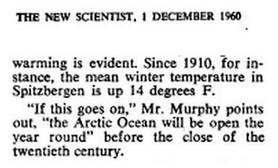
Why "The Arctic is melting!" is just Mann-made global warming scaremongering

Reblogged from Real Science:

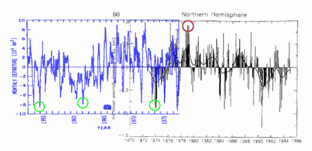
Understanding The 1979 Arctic Ice Cherry Pick

Posted on February 22, 2014 by stevengoddard

Climate fraudsters like to claim that Earth began in 1979, the year of peak Arctic sea ice. The graph below shows why. If they started their graph in 1954, there would be almost no downwards trend to the present.


journals.ametsoc.org/doi/pdf/10.1175/1520-0485(1979)009<0580>2.0.CO%3B2


Reblogged from Global Warming Solved:

Is the Arctic melting?

Ice trends

The satellite records only began in October 1978, however. This coincided with the start of a recent warming trend in the Arctic. Before that, from the 1950s-1970s, Arctic temperatures were cooling. So, it is quite likely that in the decades immediately before the satellite records began, average Arctic sea ice extent was actually increasing, but we just weren’t monitoring it. It seems that the Arctic sea ice extent naturally goes through periods of expansion, followed by periods of contraction.


In case you’re unsure about which is which, the Arctic is the polar region in the north (the one with polar bears, etc.) and the Antarctic is the polar region in the south (the one with penguins, etc.)

In this essay, we look at what we know about Arctic sea ice extent.

1. The satellite era
2. What do we know about Arctic temperatures?
3. The pre-satellite era
4. The great Arctic explorers
5. Conclusions

1. The satellite era

Every winter, the sea ice in the polar regions grows, but then in the summer, it melts again.


Figure 1. Minimum and maximum sea ice extents for northern and southern hemispheres in 1979. Click to enlarge.Since winter and summer are reversed between the southern and northern hemispheres, this means that as the Arctic sea ice reaches its maximum extent in March, the Antarctic sea ice is reaching its minimum extent. By September, the situation has reversed (minimum Arctic and maximum Antarctic sea ice). This can be seen from the Google Earth images in Figure 1 (generated using data from NSIDC).


Figure 2. Trends in maximum (March), minimum (September) and average annual sea ice extents for the Arctic, since records began in 1979. Error bars for the average value correspond to the standard errors. Click to enlarge.This cyclical pattern occurs every year. However, since satellite records began in 1979, the maximum (March) and minimum (September) sea ice extents in the Arctic seem to have been gradually decreasing. This can be seen from Figure 2 (generated using NSIDC data).


This has led many people to worry that it is man-made global warming which is causing the Arctic sea ice to melt, and that humans are therefore destroying an entire ecosystem, threatening animals such as polar bears.

As a result, much of the research in the Arctic in recent years has become dominated by a heavy focus on man-made global warming, rather than studying the Arctic as a fascinating region in itself.


Figure 3. Trends in maximum (September), minimum (March) and average annual sea ice extents for the Antarctic, since records began in 1979. Error bars for the average value correspond to the standard errors. Click to enlarge.Interestingly, even though you might expect “global” warming to occur globally, in the southern half of the world, the Antarctic sea ice extent doesn’t seem to have changed much (see Figure 3). This apparent paradox has puzzled those who believe the Arctic melting is due to man-made global warming.

As a result, some groups have struggled to come up with explanations as to why man-made global warming is not causing melting of Antarctic sea ice. For example, Zhang, 2007 (Open access) proposed that warmer waters off Antarctica might make the water less salty, and that maybe this would stop the ice from melting. We believe a much simpler explanation is that the changes in the Arctic sea ice arenot due to the “man-made global warming” assumed by current climate models. If the explanation is not “CO2-related”, then we would no longer need to worry about why the models don’t match the data – it would just mean that the models are wrong.

At any rate, since the Antarctic sea ice extent doesn’t seem to be declining, the public concern over sea ice seems to be confined to the Arctic. With that in mind, let us limit our discussion in this essay to the Arctic, i.e., the region which has shown a decrease in polar sea ice. The fact that the Arctic sea ice seems to have been steadily decreasing “since records began” does initially seem alarming. However, as we will see below, this is because “the records” only began in October 1978, as the satellites weren’t launched until then.
There may be some problems with the satellite estimates of sea ice extent, e.g., see here. Estimating sea ice extent from satellites is a complex problem – the satellites aren’t actually photographing the amount of ice, so it’s not a simple case of looking at a photograph and saying “oh, there’s some ice there, and none there”.

Instead, they measure microwave emissions. Analysts then try to convert those measurements into estimates of sea ice. These conversions rely on several different assumptions being valid. If there are problems with those assumptions, it may affect the reliability of the satellite estimates.

However, for the purposes of this post, we assume that the satellite estimates are reliable.

2. What do we know about Arctic temperatures?


Figure 4. Top panel: Unadjusted average temperature trends of all GHCN stations in the Arctic Circle. Thick solid line corresponds to a smoothed average (11 point binomial). Bottom panel: Number of stations available in a given year. Taken from our Urbanization bias III paper. Click to enlarge.In Figure 4, the average annual temperature trends for the Arctic are shown (the graph is taken from our “Urbanization bias III” paper – Provide link!). We can see that there has indeed been a warming trend since the late 1970s. However, if we look at the rest of the data, the problem of the sea ice record only beginning in 1979 should become obvious – the warming trend since the 1970s followed acooling trend from the 1940s. If the sea ice records had started just a bit earlier, they would probably have first shown sea ice growth!

Before the 1940s-1970s Arctic cooling, there also seems to have been another warming period (1900s-1930s). We do not have enough weather records to reliably tell what happened to Arctic temperatures before the 20th century, but it is at least plausible that similar cooling and warming periods also occurred then. It seems that temperatures in the Arctic naturally alternate between periods of warming and periods of cooling.

In the next sections, we will argue that sea ice conditions in the late 1970s were relatively severe. So, the fact that the Arctic sea ice extent seems to have been decreasing since then is not an indicator of “unusual and dramatic melting of the Arctic”. Instead, it seems that the satellite monitoring of the Arctic sea ice just coincidentally started at the wrong time, i.e., just when the last Arctic cooling period had ended!

But before we get to that, some readers might say, “If you look at the graph of Arctic temperatures since 1880, the linear trend shows warming, so that must be due to human activity!”. Well, no.

First, the trends are non-linear, so the “linear trend” is irrelevant. There are periods of both warming and cooling, so the linear trend changes depending on where you start and end your analysis. If you want to, you can technically calculate a “linear trend” for any (x,y) dataset, but if it is non-linear data, as is the case here, then it is a meaningless calculation. See our “Urbanization bias I” paper for more discussion (Provide link!).

Second, there is no reason to assume warming must be “man-made”, rather than just a natural occurrence. For instance, Prof. Syun-Ichi Akasofu, the founding director of the International Arctic Research Center (retired in 2007) argues that the world may still be recovering naturally from the Little Ice Age of the 18th and 19th centuries. Dr. Willie Soon has found that the warming and cooling trends in the Arctic are actually strongly correlated to changes in solar activity, e.g., Soon, 2009 (Abstract; Google Scholar access).


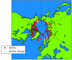
Figure 5. Locations of stations used for constructing the above graph. The 6 stations with data for at least 75 of the last 80 years are shown with white squares. Click to enlarge.Finally, as we discuss in our “Urbanization bias III” paper (Provide link!), there are very few stations with long records available for the Arctic (see the bottom panel of the earlier figure showing Arctic temperature trends). The map in Figure 5 shows the locations of all the available stations – only six of the stations have data for 75 of the last 80 years, and five of them are from a relatively small region (northern Scandinavia).

This means that if there are non-climatic biases in any of the station records, it could strongly alter the apparent trends of the average “Arctic temperatures”. This is a particular concern for periods when the number of stations were very low, e.g., there appears to have been a sudden warming step change at about 1920, but there were only a few stations actually available then, so it is hard to know if the apparent step change was genuinely climatic.

For example, many of the Arctic stations are airport stations, and improvements in the airport infrastructure, such as insulation of permafrost-based runways (e.g., Instanes & Mjureke, 2005) could easily have introduced warming biases in recent decades.

Also, you might not think urbanization bias would be a major problem in the Arctic, since most of the big cities are at lower latitudes. But, in tundra conditions, even modest urbanization can introduce significant biases.


Figure 6. Comparison of temperature trends for two of the six Arctic stations with relatively long and complete records. Thick solid lines correspond to smoothed averages (11 point binomial). Taken from our Urbanization bias III paper. Click to enlarge.For instance, even though Barrow, Alaska (USA) still has a relatively small population (4,500 in 2000), urbanisation has led to a considerable urban heat island there in recent years – see Hinkel et al., 2003(Open access). This would have introduced an artificial warming trend which would make the recent warm period seem warmer than it actually was. In comparison, the rural Sodankylä, Finland station also shows a warming trend since the late 1970s, but it followed a cooling period from the 1940s, and its warmest year was actually in 1937 (see Figure 6).

So, unfortunately, the data is really too limited to make definite conclusions (e.g., only six stations with data for 75 of the last 80 years, and at least one of them is known to have an urban heat island). It may well be that the recent warm period was warmer than the early 20th century warm period, as the raw data suggests… Or it may be that biases in the raw data are substantial, and the early 20th century warm period was just as warm as the recent warm period, or maybe even warmer.

Whatever the case, it is clear that the Arctic seems to alternate between periods of warming and periods of cooling. Hence, the fact that “the Arctic sea ice has been decreasing since records began” is merely down to the fact that the records only began in 1978. In the next sections, we will try to estimate how sea ice varied, before the satellite era.

3. The pre-satellite era

A few groups have attempted to construct sea ice estimates for the pre-satellite era using various combinations of land, ship, submarine, buoy and aircraft measurements made over the years, e.g., the Chapman & Walsh dataset or the Zakharov dataset (Note that the server for the Zakharov dataset is not always online, so the link sometimes doesn’t work). These datasets represent a considerable amount of compilation work, and probably could be used to extract useful climate information. But, as we will discuss below, there are too many inconsistencies in the data sources for a simple analysis.

Some people have used these datasets to argue that the decreasing trend during the satellite era is an acceleration of an already decreasing trend in the pre-satellite era. For instance on the “Open Mind” blog, the blogger “Tamino” has used the Walsh & Chapman dataset to claim that the satellite era melt is unprecedented, e.g., here. However, these datasets should not be used for estimating long term trends. The problem is that such datasets are actually composite datasets constructed by compiling together as many measurements as the researchers can for a given year.

The measurement sources vary dramatically over the years. For instance, in Siberia, measurements up until the late 1930s were mostly from shipping lane reports, while after the late 1930s they mostly came from aircraft measurements. In addition, the actual regions with available data varied substantially over the decades. So, a sea ice estimate for a region constructed from shipping reports in the 1920s might not be directly comparable to an estimate for the same region from the 1940s made from aircraft measurements. Hence, they cannot be used for calculating long term trends.

We suspect that with careful work and calibration, it might be possible to construct useful long term trends for at least part of the pre-satellite era. However, they don’t seem to be reliable yet. For example, we saw in the previous section, that the temperature records show a period of substantial warming followed by a period of substantial cooling up to the satellite era. But, pre-satellite sea ice datasets such as Walsh & Chapman’s don’t show any of that variability in the pre-satellite era.

So, unfortunately, we can’t use the pre-satellite estimates for assessing how unusual the recent melting has (or hasn’t) been. Fortunately, there are ways of assessing how unusual the sea ice in 1979 (at the start of the satellite era) was. If the claim that the recent Arctic melting is unusual and due to man-made global warming were true, then this would mean that the sea ice extent in September 1979 was relatively low (September being the month of minimum sea ice in the Arctic).

In the following section, we will assess this claim, by trying to answer the question, “Would the great 19th and early 20th Arctic explorers have been able to carry out all their voyages if they had attempted it during 1979 conditions?” If September 1979 sea ice extent was already quite low, then 1979 conditions would have been relatively easy for them. However, as we will see, many of the early explorers managed to get much further than they could have in 1979. In other words, at the time of those voyages, the sea ice extent was probably much lower than it was at the start of the satellite era.

Three new papers find most of the alleged global warming since 1850 is artificial

A family of scientists have submitted for open peer review 3 new papers which demonstrate that almost all of the alleged global warming of 0.7C since 1850 is artificial due to poor-siting of thermometers in urban areas. The authors also examined one of the computer programs designed to remove the "urban heat island" [UHI] bias in global temperature datasets and found errors in the program which actually increased the artificial urban heat bias. 

The papers corroborate prior work by Joe D'Aleo and Anthony Watts, as well as other peer-reviewed publications finding most to all of the alleged global warming over the 20th century may be entirely artificial and inadequately removed by homogenization procedures. 

The same authors have also submitted for open peer review 3 other papers challenging the conventional view of the physics of the atmosphere and the "greenhouse effect."

Summary: “Urbanization bias” – Papers 1-3

December 5, 2013  Our papers,   Temperature records

Many areas around the world have become highly urbanized over the last century or so. Records of weather stations which are located in urbanized areas may show artifical warming trends due to urbanization bias. In this essay, we summarise the main points of our three “Urbanization bias” papers, which we have submitted for peer review at the Open Peer Review Journal.
It has been known since at least the 19th century that urban areas are warmer than rural areas. This is known as the “urban heat island” effect.

This is a serious problem for estimating global temperature trends because many weather stations are now showing warming from an urban heat island, which wouldn’t have been there 100 years ago. That is, gradual urbanization has introduced an artificial warming bias into their weather records. This bias is called “urbanization bias”.

Since the 19th century, and particularly in the last few decades, the world has become increasingly urbanized. Urban areas still only comprise about 1%. So, this doesn’t really have much impact on actual global temperature trends. But, about half of the weather stations used for analysing global temperatures are in urban areas. As a result, the estimated global temperature trends are seriously affected by this bias.

These estimated global temperature trends are the main basis for the claims that there has been “unusual global warming” since the Industrial Revolution. This means that much of the “global warming” that people are worried about is probably just urbanization bias!

Despite that, several studies have claimed that urbanization bias isn’t a problem. So, in Paper 1, we carefully analysed these studies to see if their claims were justified. In all cases, we found that they weren’t! It turns out that the authors of those studies had each made basic errors and/or hadn’t looked at their data carefully enough.

One of the groups using weather records to calculate global temperature trends has developed a computer program which they believe has removed the urbanization biases from their data. However, in Paper 2, we analysed this program in detail and found that it didn’t work. It actually introduced as many biases as it removed!

In Paper 3, we studied the main weather station archives used for calculating global temperature trends, i.e., the Historical Climatology Network datasets.

The U.S. component of the datasets was the most reliable component and most of the U.S. stations were fairly rural. However, we found that urbanization bias had introduced an artificial warming trend of about 0.7°C/century into the urban stations. To put this in context, the “unusual global warming” that has allegedly occurred since the Industrial Revolution is supposedly about 0.8°C/century.

For the rest of the world, the Historical Climatology Network datasets didn’t actually have enough rural stations with sufficiently long records to estimate global temperature trends. Only EIGHT of the rural stations had data for at least 95 of the last 100 years!

This means that the claims that there has been “unusual global warming since the Industrial Revolution” are mostly based on data from urban stations, and much of it is probably an artefact of urbanization bias.


1. Introduction
2. What is the urban heat island problem?
3. Isn’t there other evidence for global warming?
4. Paper 1. Is urbanization bias a negligible problem?
5. Paper 2. An assessment of the NASA GISS urbanization adjustment method
6. Paper 3. How heavily urbanized are the stations used in the global temperature estimates?
7. Conclusions

1. Introduction

The main basis for the claim that there has been “unusual” global warming since the Industrial Revolution arises from the various global temperature estimates constructed from weather station records. Currently there are 5 groups publishing such estimates:


NASA Goddard Institute for Space Studies (New York City, USA)
Climate Research Unit, University of East Anglia (East Anglia, UK).
NOAA National Climatic Data Center (North Carolina, USA)
Tokyo Climate Center, Japan Meteorological Agency (Tokyo, Japan)
Berkeley Earth (California, USA)

A sixth group (originally based in Russia, but now based in USA) also updated their analysis in 2006 – see Lugina et al., 2006, Carbon Dioxide Information Analysis Center (Tennessee, USA).


Figure 1. Comparison between the various weather station-based global temperature estimates, relative to 1961-1990. The solid black line represents the smoothed mean of all estimates.

All estimates imply that there has been an almost continuous 'global warming' since 1880. Many people have blamed this on the increase in CO2 concentrations since the Industrial Revolution. However, this period has also seen a dramatic increase in urban population (bottom panel). So, much of theapparent 'global warming' might just be urbanization bias. Click on image to enlarge.As can be seen from Figure 1, all of these global temperature estimates give pretty much the same result. Since the start of each estimate (usually 1880), they all suggest that global temperatures have been fairly steadily increasing by about 0.8°C/century.

Atmospheric carbon dioxide (CO2) concentrations have also been steadily rising since the late 19th century, and man-made global warming theory predicts that increasing carbon dioxide should cause “man-made global warming”. For this reason, many supporters of the theory assume that this apparent “global warming” is the “man-made global warming” their theory had predicted.

This has convinced many people that:
The man-made global warming theory must be correct
The weather station-based global warming estimates must be accurate

However, as we will discuss in this essay, many of the weather station records used for these estimates of global warming contain artificial warming biases, which are not representative of actual global temperatures.

The problem is that most weather station records are not kept for monitoring long term temperature trends. Instead, they are usually used for making more accurate weather forecasts, making farming decisions, helping air traffic control, and other similar short-term decisions.

A consequence of this is that the long-term records contain a lot of “non-climatic biases”. These are temperature changes which are not climatic, but are due to local changes in the station and its environment over the decades and centuries.

For example, if a station is re-located, a new type of thermometer is introduced, or new buildings are built to accommodate the staff, this could alter the temperature of the air in the immediate vicinity of the thermometer. If these local changes are not taken into account when the long-term temperature record is being analysed, this would mistakenly leave the impression that the climate itself had changed. In reality, it is only a change in themeasured temperature, not a change in the actual climatic temperature.

This means that the temperature trends in any weather station record are a combination of:
Actual climatic trends for the region
Non-climatic biases

One of the biggest problems in accurately calculating “global temperature” trends from weather records is in separating the two, and only including the actual climatic trends.

This is not easy. In fact, it is very challenging, e.g., see Mitchell, 1953 (Open access).

Our analysis shows that the 6 groups we mentioned above that have being calculating the “global warming” trends didn’t do a good enough job in accounting for these biases. They seem to have severely underestimated just how tricky a job it actually is.

Chief amongst these non-climatic biases is urbanization bias, and this is the focus of this essay.
On this website, we usually use the U.K. spelling for most words instead of the U.S. spelling, but most of the literature on urban heat islands uses the U.S. spelling, e.g., “urbanization” instead of “urbanisation”. So, in our papers and in this essay, we use the U.S. spelling for urbanization.

In general, urban areas tend to be warmer than rural areas. If you are a car owner and have a thermometer in your car, you may have noticed this, i.e., the temperature generally rises when you drive into an urban area and decreases when you leave an urban area.

As a result of this extra urban warmth, if a weather station becomes urbanized, this introduces an artificial warming bias into the station’s record, i.e., urbanization bias.

If a substantial fraction of all the weather stations from around the world have been affected by urbanization bias, then this could have introduced an artificial warming trend into the “global temperature trend” estimates. That would mean that some (or even all!) of the alleged “unusual global warming” since the Industrial Revolution is just an artefact of urbanization bias!

With this in mind, we decided it was to important to carefully investigate the urbanization bias problem, and check if it had been adequately dealt with. We have written a series of three companion papers describing the results of our investigation, and have submitted them for peer review on the Open Peer Review Journal forum we founded:

Urbanization bias I. Is it a negligible problem for global temperature estimates? – Ronan Connolly & Michael Connolly, 2014a
Urbanization bias II. An assessment of the NASA GISS urbanization adjustment method– Ronan Connolly & Michael Connolly, 2014b
Urbanization bias III. Estimating the extent of bias in the Historical Climatology Network datasets – Ronan Connolly & Michael Connolly, 2014c

Interested readers are welcome to read our three papers for a detailed assessment of the urbanization bias problem. However, each of the papers is quite long and technical, and so we have written this essay to provide a general overview of our main findings and conclusions.

In a nutshell, we found that urbanization bias has seriously affected the various global temperature trend estimates. It seems that most of the “unusual global warming” that we have heard so much about had absolutely nothing to do with our carbon footprint, but was just a consequence of urbanization bias!

The various attempts that have so far been made to deal with the urbanization bias problem have been woefully inadequate. In many cases, they actually seem to have made the problem even worse. The popular belief that the problem has been “dealt with” (e.g.,here, here, here, here, here, or here) just seems to be down to wishful thinking…

However, before we can discuss our findings, let us first consider in a bit more detail exactly what the urbanization bias problem is…

Three new papers challenge understanding of the physics of the atmosphere, AGW

A family of scientists have submitted for open peer review 3 new papers which propose a radical rethink of the physics of the atmosphere. The papers are based on weather balloon observations, theory, and laboratory experiments, and support the position of some skeptics that the entire 33K "greenhouse effect" is explainable solely on the basis of the natural lapse rate alone, with unmeasurable influence from CO2. The papers collectively demonstrate man-made greenhouse gases have a trivial, unmeasurable effect on global temperatures.

In addition, the papers have implications for a number of important phenomena related to the atmosphere, e.g., ozone formation, the locations of the jet streams, and how tropical cyclones form.

The three papers are receiving a hostile reception from the alarmist community, but are being well defended by the authors in the comment sections. 

Summary: “The physics of the Earth’s atmosphere” Papers 1-3

Our papers
For two of our papers, we analysed the temperatures at different heights in the atmosphere using measurements from weather balloons, similar to this one. 
In this essay, we will briefly summarise the analysis in our three “Physics of the Earth’s atmosphere” papers, which we have submitted for peer review at the Open Peer Review Journal.

In Paper 1, we developed new analytical techniques for studying weather balloon data. Using these techniques, we found that we were able to accurately describe the changes in temperature with height by just accounting for changes in water content and the existence of a previously unreported phase change. This shows that the temperatures at each height are completely independent of the greenhouse gas concentrations.

This disproves the greenhouse effect theory. It also disproves the man-made global warming theory, which is based on the greenhouse effect theory.

In Paper 2, we suggest that the phase change we identified in Paper 1 involves the “multimerization” of oxygen and/or nitrogen in the air above the “troposphere” (the lower part of the atmosphere). This has important implications for a number of important phenomena related to the atmosphere, e.g., ozone formation, the locations of the jet streams, and how tropical cyclones form.

In Paper 3, we identify a mechanism by which energy is transmitted throughout the atmosphere, which we call “pervection”. This mechanism is not considered in the greenhouse effect theory, or in the current climate models. We carried out laboratory experiments to measure the rates of pervection in air, and find that it ismuch faster than radiation, convection and conduction.

This explains why the greenhouse effect theory doesn’t work.

1. Introduction
2. The atmospheric temperature profile
3. Crash course in thermodynamics & radiative physics: All you need to know
4. Paper 1: Phase change associated with tropopause
5. Paper 2: Multimerization of atmospheric gases above the troposphere
6. Paper 3: Pervective power
7. Applying the scientific method to the greenhouse effect theory
8. Conclusions

1. Introduction

We have written a series of three papers discussing the physics of the Earth’s atmosphere, and we have submitted these for peer review at the Open Peer Review Journal:

The physics of the Earth’s atmosphere I. Phase change associated with the tropopause – Michael Connolly & Ronan Connolly, 2014a
The physics of the Earth’s atmosphere II. Multimerization of atmospheric gases above the troposphere – Michael Connolly & Ronan Connolly, 2014b
The physics of the Earth’s atmosphere III. Pervective power – Michael Connolly & Ronan Connolly, 2014c

In these papers, we show that carbon dioxide does not influence the atmospheric temperatures. This directly contradicts the greenhouse effect theory, which predicts that carbon dioxide should increase the temperature in the lower atmosphere (the “troposphere”), and decrease the temperature in the middle atmosphere (the “stratosphere”).

It also contradicts the man-made global warming theory, since the the basis for man-made global warming theory is that increasing the concentration of carbon dioxide in the atmosphere will cause global warming by increasing the greenhouse effect. If the greenhouse effect doesn’t exist, then man-made global warming theory doesn’t work.

Aside from this, the results in our papers also offer new insights into why the jet streams exist, why tropical cyclones form, weather prediction and a new theory for how ozone forms in the ozone layer, amongst many other things.

In this essay, we will try to summarise some of these findings and results. We will also try to summarise the greenhouse effect theory, and what is wrong with it.

However, unfortunately, atmospheric physics is quite a technical subject. So, before we can discuss our findings and their significance, there are some tricky concepts and terminology about the atmosphere, thermodynamics and energy transmission mechanisms that we will need to introduce.

As a result, this essay is a bit more technical than some of our other ones. We have tried to explain these concepts in a fairly clear, and straightforward manner, but if you haven’t studied physics before, it might take a couple of read-throughs to fully figure them out.

Anyway, in Section 2, we will describe the different regions of the atmosphere, and how temperatures vary throughout these regions. In Section 3, we will provide a basic overview of some of the key physics concepts you’ll need to understand our results. We will also summarise the greenhouse effect theory. Then, in Sections 4-6, we will outline the main results of each of the three papers. In Section 7, we will discuss what the scientific method tells us about the greenhouse effect. Finally, we will offer some concluding remarks in Section 8.


2. The atmospheric temperature profile

As you travel up in the atmosphere, the air temperature generally cools down, at a rate of roughly -6.5°C per kilometre (-3.5°F per 1,000 feet). This is why we get snow at the tops of mountains, even if it’s warm at sea level. The reason the air cools down with height is that the thermal energy (“heat”) of the air gets converted into “potential energy” to counteract the gravitational energy pulling the air back to ground. At first, it might seem hard to visualise this gravitational cooling, but it is actually quite a strong effect. After all, it takes a lot of energy to hold an object up in the air without letting it fall, doesn’t it?

This rate of change of temperature with height (or altitude) is called the “environmental lapse rate”.

Surprisingly, when you go up in the air high enough, you can find regions of the atmosphere where the temperature increases with altitude!


Figure 1. Schematic illustration of the changes in temperature with increasing altitude. Temperatures are given in degrees Kelvin (100K = -175°C or -280°F, while 300K = 25°C or 80°F), and are determined from the 1976 version of the U.S. Standard Atmosphere. Click on image to enlarge.For this reason, atmospheric scientists and meteorologists give the different parts of the Earth’s atmosphere different names. The average temperature profile for the first 120 kilometres and the names given to these regions are shown in Figure 1.

By the way, in this essay we will mostly be using the Kelvin scale to describe temperatures. This is a temperature scale that is commonly used by scientists, but is not as common in everyday use. If you’re unfamiliar with it, 200 K is roughly -75°C or -100°F, while 300 K is roughly +25°C or +80°F.

At any rate, the scientific name for the part of the atmosphere closest to the ground is the “troposphere”. In the troposphere, temperatures decrease with height at the environmental lapse rate we mentioned above, i.e., -6.5°C per kilometre (-3.5°F per 1,000 feet).

Above the troposphere, there is a region where the temperature stops decreasing (or “pauses”) with height, and this region is called the “tropopause”. Transatlantic airplanes sometimes fly just belowthe tropopause.

As we travel up higher, we reach a region where temperatures increase with height. If everything else is equal, hot air is lighter than cold air. So, when this region was first noticed, scientists suggested that the hotter air would be unable to sink below the colder air and the air in this region wouldn’t be able to mix properly. They suggested that the air would become “stratified” into different layers, and this led to the name for this region, the “stratosphere”. This also led to the name for the troposphere, which comes from the Greek word, tropos, which means “to turn, mix”, i.e., the troposphere was considered a region where mixing of the air takes place.

To get an idea of these altitudes, when Felix Baumgartner broke the world record for the highest skydive on October 14, 2012, he was jumping from 39 kilometres (24 miles). This is a few kilometres above where the current weather balloons reach, i.e., in the middle of the stratosphere:

At the moment, most weather balloons burst before reaching about 30-35 kilometres (18-22 miles). Much of our analysis is based on weather balloon data. So, for our analysis, we only consider the first three regions of the atmosphere, the troposphere, tropopause and stratosphere.

You can see from Figure 1 that there are also several other regions at higher altitudes. These other regions are beyond the scope of this essay, i.e., the “stratopause”, the “mesosphere” and the“mesopause”.

Still, you might be interested to know about the “Kármán line”. Although the atmosphere technically stretches out thousands of kilometres into space, the density of the atmosphere is so small in the upper parts of the atmosphere that most people choose an arbitrary value of 100 kilometres as the boundary between the atmosphere and space. This is called the Kármán line. If you ever have watched a meteor shower or seen a “shooting star”, then you probably were looking just below this line, at an altitude of about 75-100 kilometres, which is the “meteor zone”.


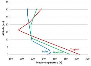
Figure 2. Atmospheric temperature profiles at different latitudes. Temperatures were downloaded from the Public Domain Aeronautical Software website. Click to enlarge.The temperature profile in Figure 1 is the average profile for a mid-latitude atmosphere. But, obviously, the climate is different in the tropics and at the poles. It also changes with the seasons. Just like ground temperatures are different at the equator than they are in the Arctic, the atmospheric temperature profiles also change with latitude. Typical temperature profiles for a tropical climate and a polar climate are compared to the “standard” mid-latitude climate in Figure 2, up to a height of 30 kilometres (19 miles).

One more term you may find important is the “boundary layer”. This is the first kilometre or two of the troposphere, starting at ground level. We all live in the boundary layer, so this is the part of the atmosphere we are most familiar with. Weather in the boundary layer is quite similar to the rest of the troposphere, but it’s generally windier (more “turbulent”) and the air tends to have more water content.

3. Crash course in thermodynamics & radiative physics: All you need to know

Understanding energy and energy equilibrium

All molecules contain energy, but the amount of energy the molecules have and the way in which it is stored can vary. In this essay, we will consider a few different types of energy. We already mentioned in the previous section the difference between two of these types, i.e., thermal energy and potential energy.

Broadly speaking, we can divide molecular energy into two categories:
Internal energy – the energy that molecules possess by themselves
External energy – the energy that molecules have relative to their surroundings. We refer to external energy as mechanical energy.

This distinction might seem a bit confusing, at first, but should become a bit clearer when we give some examples, in a moment.

These two categories can themselves be sub-divided into sub-categories.

We consider two types of internal energy:

Thermal energy – the internal energy which causes molecules to randomly move about. Thetemperature of a substance refers to the average thermal energy of the molecules in the substance. “Hot” substances have a lot of thermal energy, while “cold” substances don’t have much
Latent energy – the internal energy that molecules have due to their molecular structure, e.g., the energy stored in chemical bonds. It is called latent (meaning “hidden”), because when you increase or decrease the latent energy of a substance, its temperature doesn’t change.

When latent energy was first discovered in the 18th century, it wasn’t known that molecules contained atoms and bonds. So, nobody knew what latent energy did, or why it existed, and the energy just seemed to be mysteriously “hidden” away somehow.

We also consider two types of mechanical energy:

Potential energy – the energy that a substance has as a result of where it is. For instance, as we mentioned in the previous section, if a substance is lifted up into the air, its potential energy increases because it is higher in the Earth’s gravitational field.
Kinetic energy – the energy that a substance has when it’s moving in a particular direction.

Energy can be converted between the different types.


Figure 3. When you are cycling downhill you will speed up, even if you don't pedal ('freewheeling'), because potential energy is being converted into kinetic energy. Animated gif via from user 'adr82' on the BikeRadar.com cycling forum. Click on image to enlarge.For instance, if a boulder is resting at the top of a hill, it has a lot of potential energy, but very little kinetic energy. If the boulder starts to roll down the hill, its potential energy will start decreasing, but its kinetic energy will start increasing, as it picks up speed.

As another example, in Section 2, we mentioned how the air in the troposphere cools as you travel up through the atmosphere, and that this was because thermal energy was being converted into potential energy.

In the 18th and 19th centuries, some scientists began trying to understand in detail when and how these energy conversions could take place. In particular, there was a lot of interest in figuring out how to improve the efficiency of the steam engine, which had just been invented.


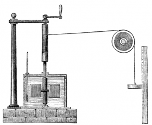
Figure 4. Experimental apparatus used by James Joule in 1845 to show how mechanical energy could be converted into thermal energy. Illustration taken from Wikimedia Commons. Click on image to enlarge.Steam engines were able to convert thermal energy into mechanical energy, e.g., causing a train to move. Similarly,James Joule had shown that mechanical energy could be converted into thermal energy.

The study of these energy interconversions became known as “thermodynamics”, because it was looking at how thermal energy and “dynamical” (or mechanical” energy were related.

One of the main realisations in thermodynamics is thelaw of conservation of energy. This is sometimes referred to as the “First Law of Thermodynamics”:

The total energy of an isolated system cannot change. Energy can change from one type to another, but the total amount of energy in the system remains constant.

The total energy of a substance will include the thermal energy of the substance, its latent energy, its potential energy, and its kinetic energy:

Total energy = thermal energy + latent energy + potential energy + kinetic energy

So, in our example of the boulder rolling down a hill, when the potential energy decreases as it gets closer to the bottom, its kinetic energy increases, and the total energy remains constant.

Similarly, when the air in the troposphere rises up in the atmosphere, its thermal energy decreases (i.e., it gets colder!), but its potential energy increases, and the total energy remains constant!

This is a very important concept to remember for this essay. Normally, when one substance is colder than another we might think that it is lower in energy. However, this is not necessarily the case – if the colder substance has more latent, potential or kinetic energy then its total energy might actually be the same as that of the hotter substance. The colder substance might even have more total energy.

Another key concept for this essay is that of “energy equilibrium”:
We say that a system is in energy equilibrium if the average total energy of the molecules in the system is the same throughout the system.

The technical term for energy equilibrium is “thermodynamic equilibrium”.

For a system in energy equilibrium, if one part of the system loses energy and starts to become unusually low in energy, energy flows from another part of the system to keep the average constant. Similarly, if one part of the system gains energy, this extra energy is rapidly redistributed throughout the system.

Is the atmosphere in energy equilibrium? That is a good question.

According to the greenhouse effect theory, the answer is no.

The greenhouse effect theory explicitly assumes that the atmosphere is only in local energy equilibrium.

If a system is only in local energy equilibrium then different parts of the system can have different amounts of energy.

As we will see later, the greenhouse effect theory fundamentally requires that the atmosphere is only in local energy equilibrium. This is because the theory predicts that greenhouse gases will cause some parts of the atmosphere to become more energetic than other parts. For instance, the greenhouse effect is supposed to increase temperatures in the troposphere, causing global warming.

However, this assumption that the atmosphere is only in local energy equilibrium was never experimentally proven.

In our papers, we experimentally show that the atmosphere is actually in complete energy equilibrium – at least over the distances from the bottom of the troposphere to the top of the stratosphere, which the greenhouse effect theory is concerned with.


Twitter exchange with "There's Physics" proprietor of the Wott's Up with That blog, now called "And Then There's Physics":


  1. How would an atmosphere without GHGs do that? I think you may be mistaken.
  2. The lapse rate alone, per ideal gas formula gravity compresses adiabatic gases to increase temp, process continually recycles
  3. Yes, but the lapse rate is just the temperature gradient. The actual temperature is set by the GHGs.
  4. We're just going in circles. I've already shown gravity > pressure > lapse rate > 33K GHE. More GHGs decrease LR > cooling
  5. You see, you haven't shown that. You've asserted that. You're right tho, we are going in circles.
  6. Haven't shown what specifically? More GHGs increase Cp which decreases LR=-g/Cp. Decreased LR=cooling